Skip to content

Bandwidth - Inventory Management

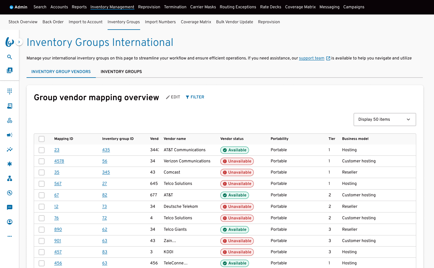
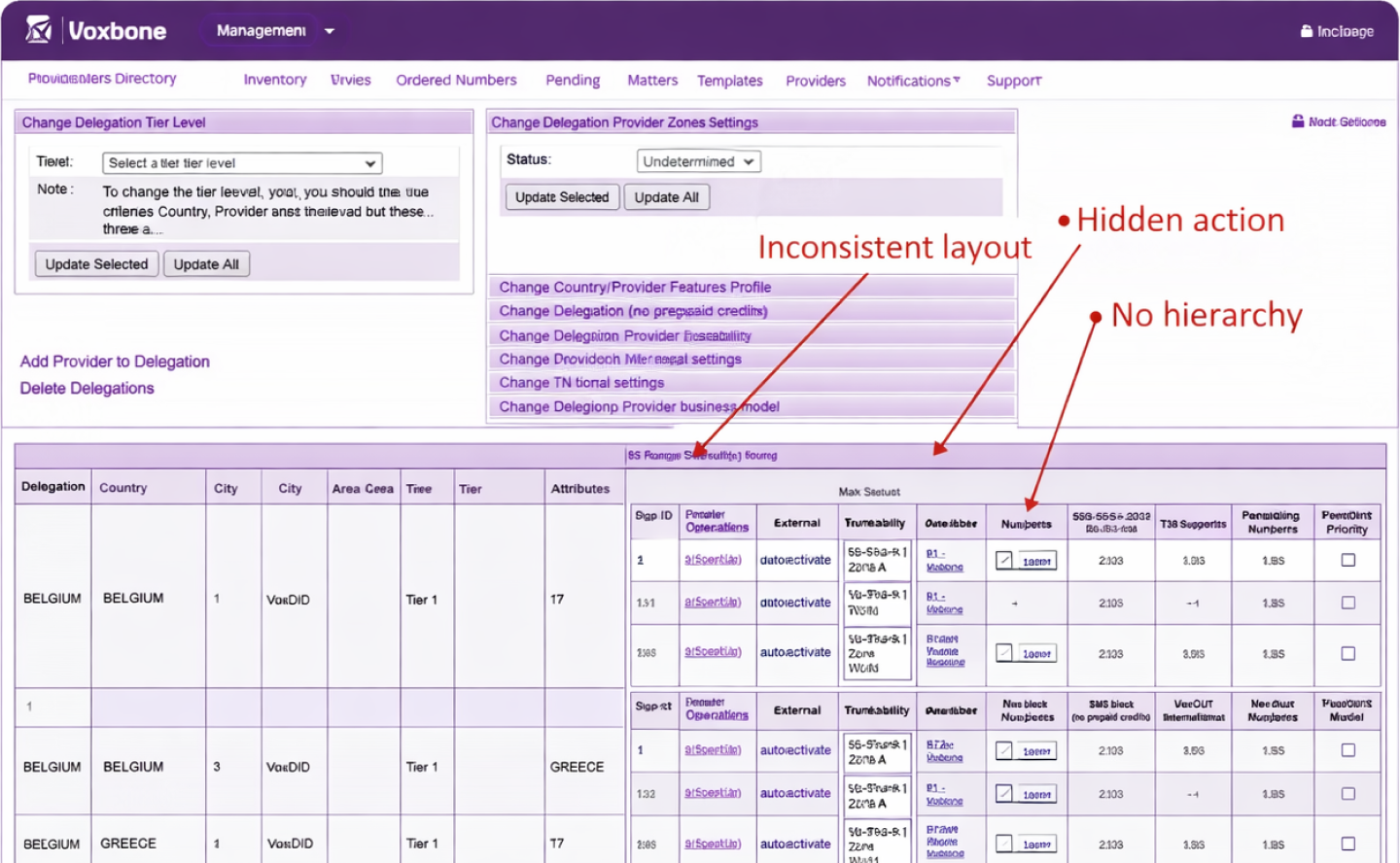
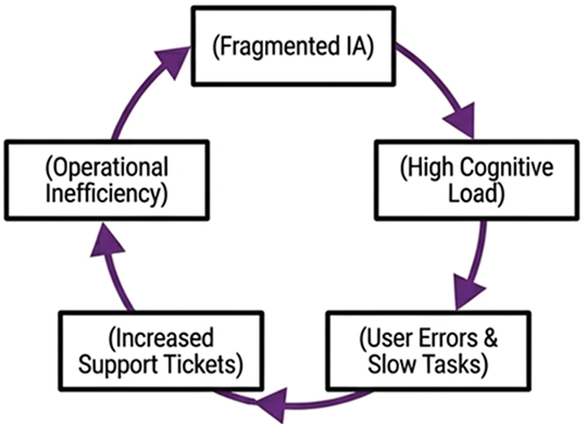
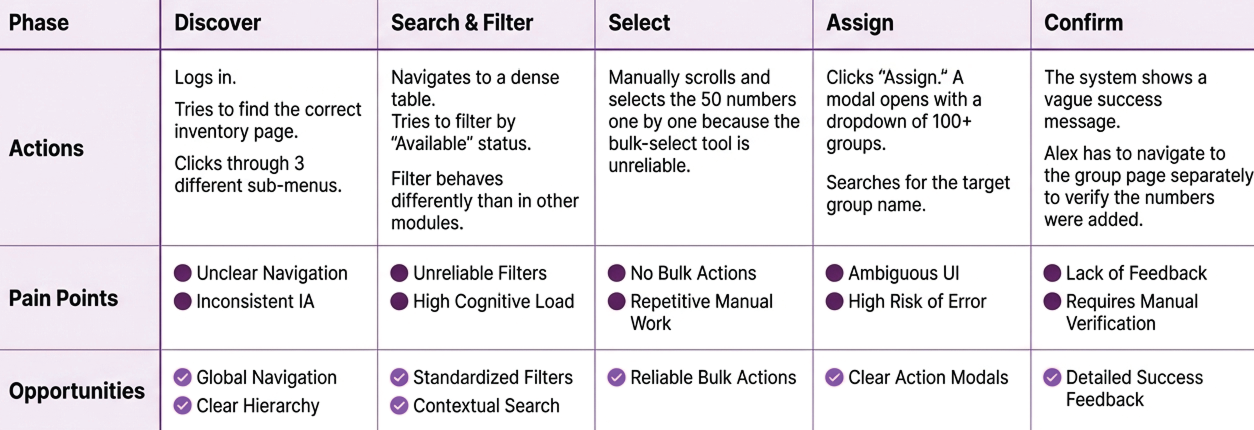
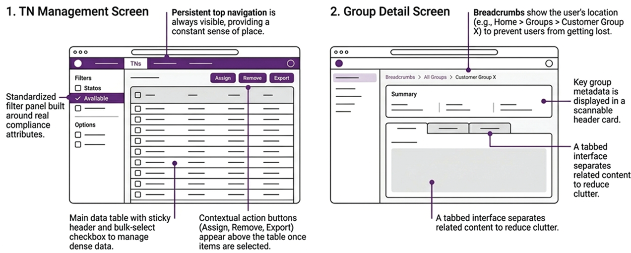
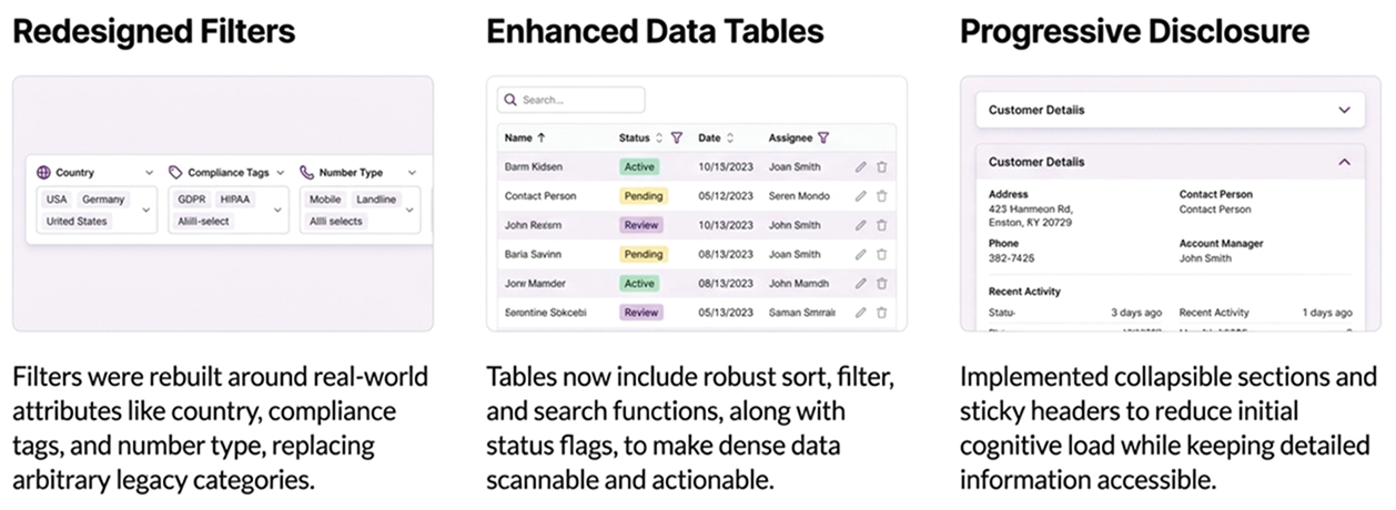
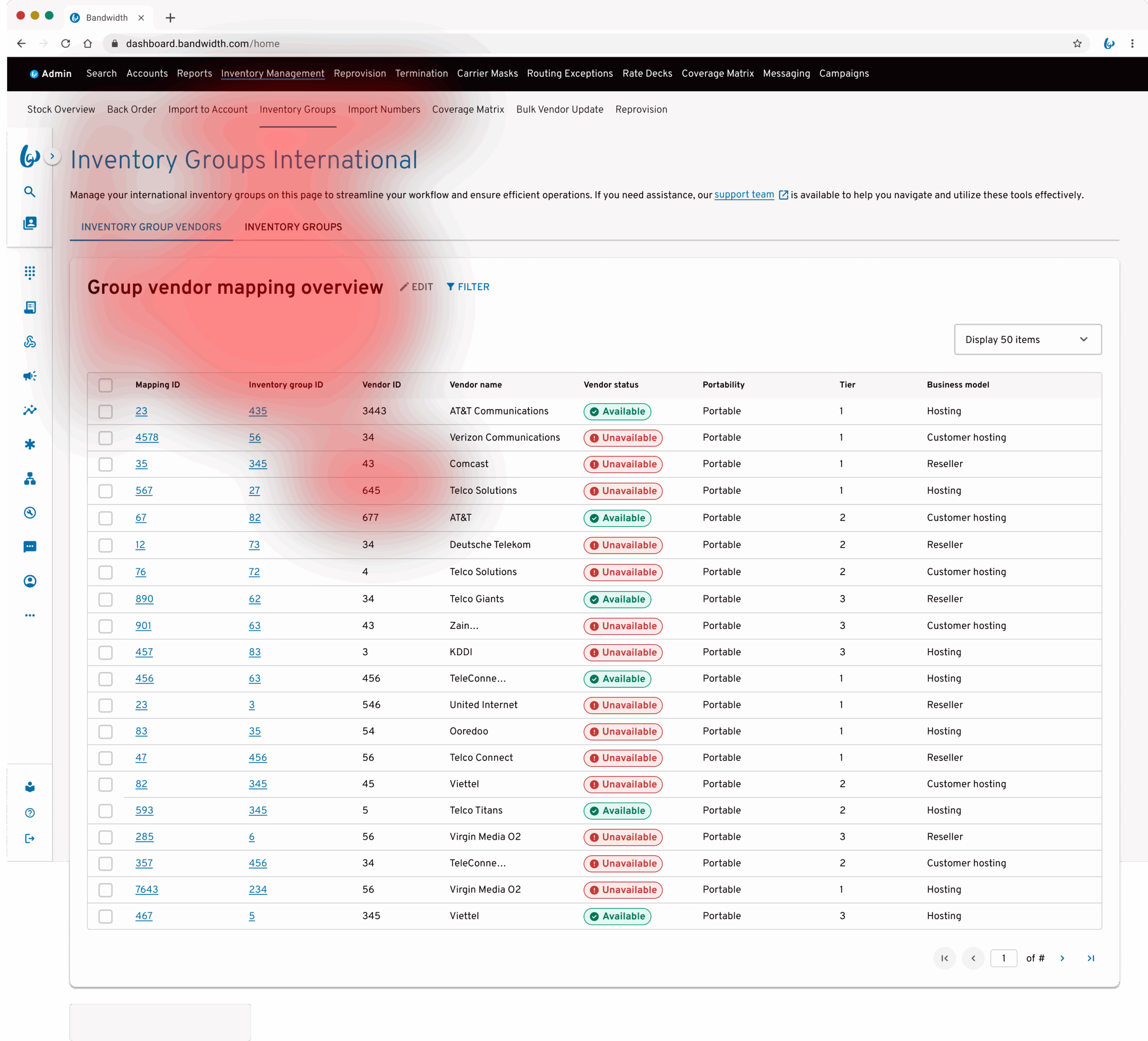
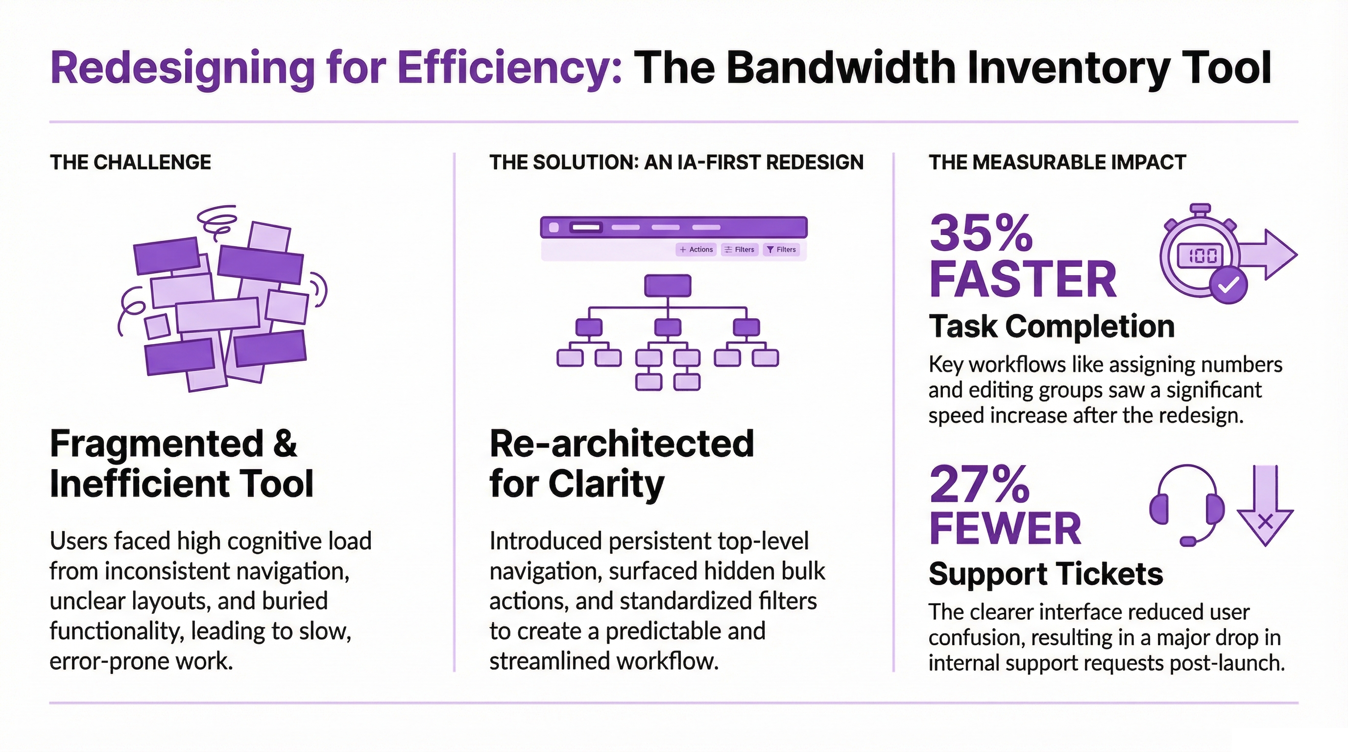
Redesigning internal workflows for faster, clearer global number provisioning

Bandwidth’s internal teams rely on Inventory Management to provision, organise, and maintain global telephone number inventory across multiple regions. Following the Voxbone integration, I redesigned the experience to create a clearer, more predictable workflow that helped operations teams work faster and with greater confidence.
Faster completion time
0 %
Fewer support tickets
0 %
Navigation errors down
0 %
Internal satisfaction score
0
macbook_pro
macbook_pro
Bandwidth Universal Platform - Inventory Management (Admin)

Role

Senior UX Designer, Lead

Duration

~5 months

TEAM

UX Manager, Product Managers, Inventory, Compliance, API & Front-End Developers

01. Problem

A critical internal system that no longer matched how teams worked

This wasn’t just a usability issue it was an operational risk. Bandwidth’s Inventory Management platform underpins how global telephone numbers are provisioned, organised, and audited across multiple regions.

Following the Voxbone integration, the experience became fragmented, combining two systems with inconsistent navigation, duplicated functionality, and conflicting interaction patterns.

What had once worked became increasingly difficult to scale, forcing teams to rely on workarounds rather than the system itself.

"This created operational friction at scale. Teams spent too long trying to find the right data, complete simple actions, and understand what had changed."

Business Impact

  • Provisioning delays slowed onboarding
  • Support teams handling avoidable queries
  • The platform struggled to scale across regions

User Pain Points

  • Inconsistent navigation across modules
  • Bulk actions difficult to find
  • The system relied too heavily on memory

02. Challenge

Understanding the complexity of internal provisioning at scale

macbook_pro
macbook_pro
Legacy Voxbone interface - fragmented, inconsistent, and difficult to scale

The challenge wasn’t just to redesign screens, it was to realign the system with how teams actually worked. It was that the structure underneath no longer supported how operations teams worked day to day.

The original system had been organised around country-based modules and inherited data structures. In practice, users thought in terms of tasks the gap between system structure and operational behaviour was where most friction lived.

Key Challenges

  • Navigation varied across regional modules
  • Bulk actions were hidden or inconsistent
  • TN and group-level information were mixed together
  • Tables were dense and difficult to scan
  • Users had no reliable mental model of where to go next

Root Issue

Users could not build a reliable mental model of the system. Without predictable structure and patterns, even simple tasks became slow and error-prone.

03. Objective

Creating a clear, predictable and scalable internal provisioning experience

The aim of this project was to replace an opaque and inconsistent workflow with a clear, guided journey that customers could trust. We needed an experience that improved accuracy, reduced dependency on support teams and could scale as Bandwidth entered new markets.

Success Meant Delivering

04. Discovery & Insights

How we understood internal workflows

Legacy workflow: repetitive, unclear, and reliant on support

“The strongest pattern was that the interface reflected system logic, not operational logic. Users thought in tasks, but the system was organised by entities and regions.”​

The core issue became clear early, the system reflected engineering logic, not operational logic.

Rather than starting with assumptions, I began by observing how teams actually used the tool. I sat with Compliance Ops analysts during live workflows, watched where they hesitated, and noted where the system forced them to rely on memory, workarounds, or support.

That was paired with a heuristic evaluation of the existing interface, card-sorting workshops, and early concept testing. The goal was to understand the logic users had already built in order to get their work done.

Research methods

Heuristic Evaluation

Audited the existing interface and highlighted repeated issues in navigation, hierarchy, and interaction consistency.

Card Sorting

Showed that users grouped work by task, not by country or system structure.

Workflow Observation

Revealed how often analysts relied on memory and repeated navigation patterns.

Stakeholder Workshops

Created shared agreement on which workflows mattered most and what success would look like.

Usability Testing

Validated that the new IA reduced errors and made key tasks easier to complete.
5 METHODS
Each chosen to reveal a different layer of how teams actually worked.

Personas

Picture of Maria T.
Maria T.

Operations Support

Handles escalations and troubleshooting across regional inventory views. Needs consistent layouts, clearer search paths, and faster access to the right data.
Picture of Alex R.
Alex R.

Compliance Ops Administrator

Manages high-volume provisioning across multiple regions and needs quick visibility into groups, filters, and status changes. Frustrated by having to click through multiple screens to complete simple actions.

User journey

Key insights

The disconnect between system logic and operational behaviour created friction in five consistent ways:

01

Users relied on memory over navigation

02

Bulk actions were hidden

03

TN and Group data were mixed

04

Filters did not reflect how users actually searched

05

Inconsistency caused repeated errors

Patterns identified during research highlighted opportunities to reduce manual effort, improve accuracy, and support decision-making through intelligent assistance.

Intelligent navigation

Reduce reliance on memory by surfacing the next likely action based on user behaviour and workflow context.

Contextual action suggestions

Surface relevant bulk actions automatically based on selected data, reducing the need to search through menus.

Smart filtering & search

Recommend filter combinations based on common usage patterns, helping users find the right data faster.

Predictive validation & guidance

Prevent errors before they happen by identifying issues early and providing clear, actionable feedback.

05. IA & Workflow Redesign

From fragmented workflows to one predictable system

I restructured the information architecture around how teams actually worked — not to simplify by hiding information, but to make the system easier to understand, navigate, and scale.

Before

  • • Country-based navigation fragmented workflows
  • • No clear hierarchy or orientation
  • • Bulk actions hidden in nested menus
  • • TN and Group data mixed together
  • • Dense tables with low scannability
  • • No visibility into status or history

After

  • • Task-based modules (Groups, TNs, Alerts, Templates)
  • • Separation of Group and TN-level data
  • • Standardised tables, filters, and patterns
  • • Context-aware navigation and breadcrumbs
  • • Bulk actions surfaced at point of use
  • • Clear status visibility and audit history

Future

  • • Predictive alerts for expiring or invalid numbers
  • • AI-assisted provisioning suggestions
  • • Automated number state transitions
  • • Operational dashboards with real-time insights
Al-Enhanced

Re-architecting around how teams work

01

Groups

Manage and edit inventory clusters
02

TNs

View, assign, and remove numbers
03

Alerts

Surface issues and expirations
04

Templates

Standardise provisioning rules across regions

What changed structurally

06. Wireframing & Iteration

Bringing clarity into the core flows​

I explored several concepts to simplify the experience, reduce cognitive load and create a predictable structure for all markets. Working closely with Compliance and Engineering ensured each decision was accurate, feasible and aligned with the wider platform.

Design Principles

Reduce cognitive load

Standardise patterns

Improve wayfinding

Use progressive disclosure

07. Design Execution

Making density feel manageable​​

Internal tools tend towards density. There is always more data to show, more filters to support, and more actions to expose. The challenge was not to strip that back unrealistically, but to create a visual hierarchy that let users focus on what mattered at each step.

I introduced persistent structure, contextual actions, and clearer separation between data types so users could stay oriented while moving through large, high-volume workflows.

01

Guided Structure & Visual Hierarchy

Sticky headers, persistent filters, and clearer grouping helped users stay oriented while navigating dense data views.
02

Context-Aware Actions & Workflows

Actions such as Assign, Remove, and Export appeared based on what the user had selected, reducing clutter and unnecessary scanning.
03

Visibility, Feedback & Control

Improved status indicators, clearer grouping logic, and consolidated detail views gave users more confidence and reduced guesswork.

Three workflows that defined the redesign

Assign a number to a group

Search, filter, assign, confirm, redesigned as one contextual flow.
macbook_pro
macbook_pro
Inventory Management (Admin) - Number to a Group

Review TN status & history

A single view showing the lifecycle of a number, without cross-referencing multiple screens.
macbook_pro
macbook_pro
Inventory Management (Admin) - Number Status and History

Remove expired TNs in bulk

Filter, select, remove, confirm, replacing repetitive row-by-row actions.
macbook_pro
macbook_pro
Inventory Management (Admin) - Removing Number Bulk Tool
macbook_pro
macbook_pro

Design System Integration

Every component was built using or contributed back to Bandwidth’s BluePrint design system. This improved consistency, sped up delivery, and created reusable patterns for future internal tools.

  • Reusable filter, modal, and table variants
  • Accessibility annotations for focus states and keyboard behaviour
  • Detailed Figma specs for handoff and reuse

08. Guided Walkthrough

What the new journey looks like

The redesigned experience gave users a clearer path through the tasks they performed most often. Each step was designed to feel natural and predictable.

macbook_pro
STEP 1

Choose the right module

STEP 2

Filter by region, status, or context

STEP 3

Review the relevant details

STEP 4

Take action in context

STEP 5

Confirm the result with confidence

09. Testing & Outcomes

Validating the solution

To ensure the redesign delivered meaningful improvements, I tested the new workflows through moderated usability sessions, task-based validation, and A/B comparisons against the legacy interface.

Methods

  • Usability Testing

    Moderated sessions with Compliance Ops and Product Support teams

  • Task Completion Analysis

    Measured speed and accuracy across key workflows

  • A/B Comparison

    Benchmarked the redesigned flows against legacy patterns

The most meaningful shift was not just speed, but confidence. During testing, users stopped asking where to go next. The structure finally matched the way they already thought about the work.

macbook_pro
macbook_pro
Inventory Management - Usability Test

“For the first time, I don’t have to think about where things are, I just go straight there.”

"Bulk actions alone have saved me so much time. This used to take forever."

10. Impact

A scalable foundation for global provisioning

This redesign went beyond improving a single tool. It established a scalable model for how internal systems at Bandwidth could be structured, designed, and delivered. The IA and interaction patterns introduced in Inventory Management became a reference point for future tools  shifting the organisation towards more consistent, system-driven design.

35%

Faster task completion

27%

Fewer support tickets

30%

Fewer navigation errors

4.6 / 5

Internal satisfaction score

Business

Product

User

A foundation, not just a facelift

The redesign did more than improve one internal tool. It created a repeatable model for structuring high-volume operational workflows at Bandwidth. The IA and interaction patterns introduced here became a reference point for future internal products.
"The new layout finally makes sense. I can find, filter, and fix issues faster without asking for help."
Compliance Ops Analyst
"This redesign drastically improved team efficiency, one of our most successful internal UX upgrades."
Product Manager, Bandwidth

11. Future Opportunities

Where this work can evolve next

The redesign created a stronger operational foundation. The next step is to build intelligence and visibility on top of that structure.

Predictive alerts

Surface provisioning issues before they escalate

AI-assisted validation

Help users complete actions correctly the first time

Predictive approval estimates

Set better expectations during high-volume workflows

Operational analytics

Give teams visibility into efficiency and inventory health

Reflection

“Good internal UX removes friction quietly.”

When people stop thinking about the tool and start focusing on the work, that’s when design is doing its job.

This project reinforced a core belief: internal users deserve the same level of care and clarity as any external customer. It also showed the value of getting information architecture right early — those decisions shaped every screen and interaction that followed.

Finally, designing within BluePrint meant we did more than improve one tool. We created reusable patterns that accelerated future work across the organisation.

Selected projects​