


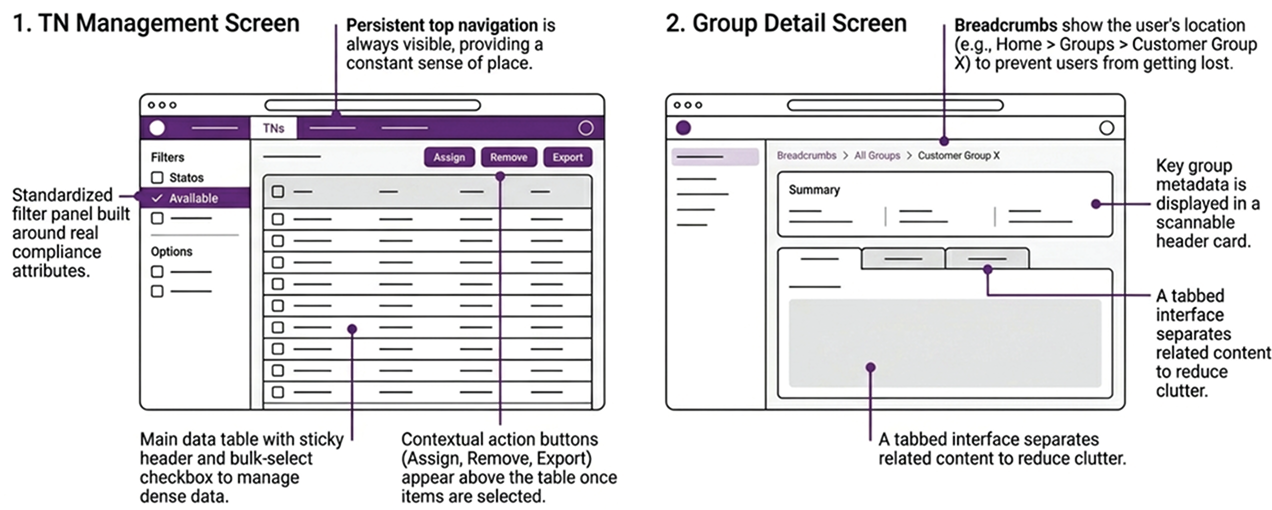
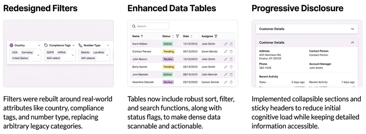


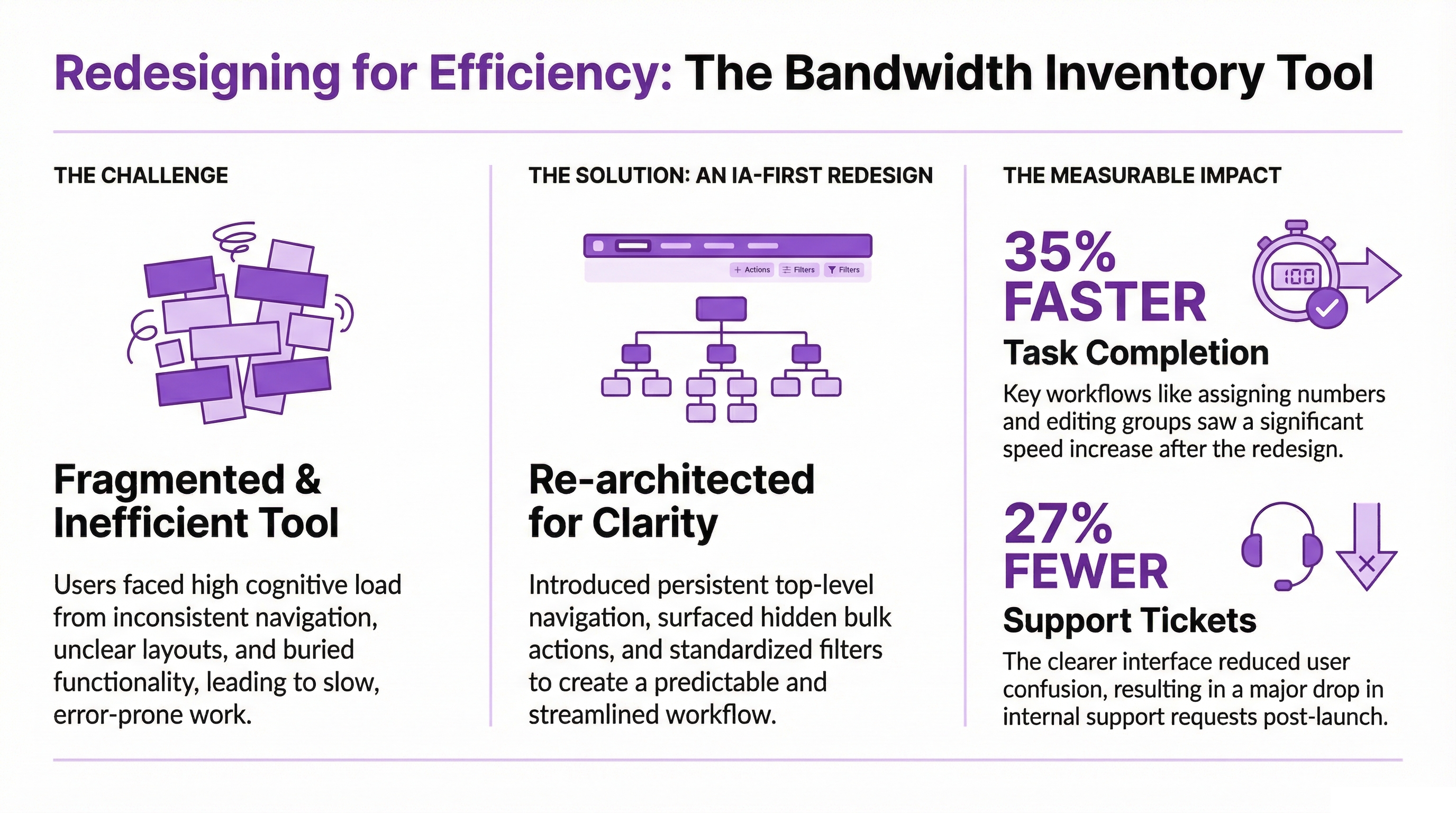
Redesigning internal provisioning workflows for faster, clearer global number management
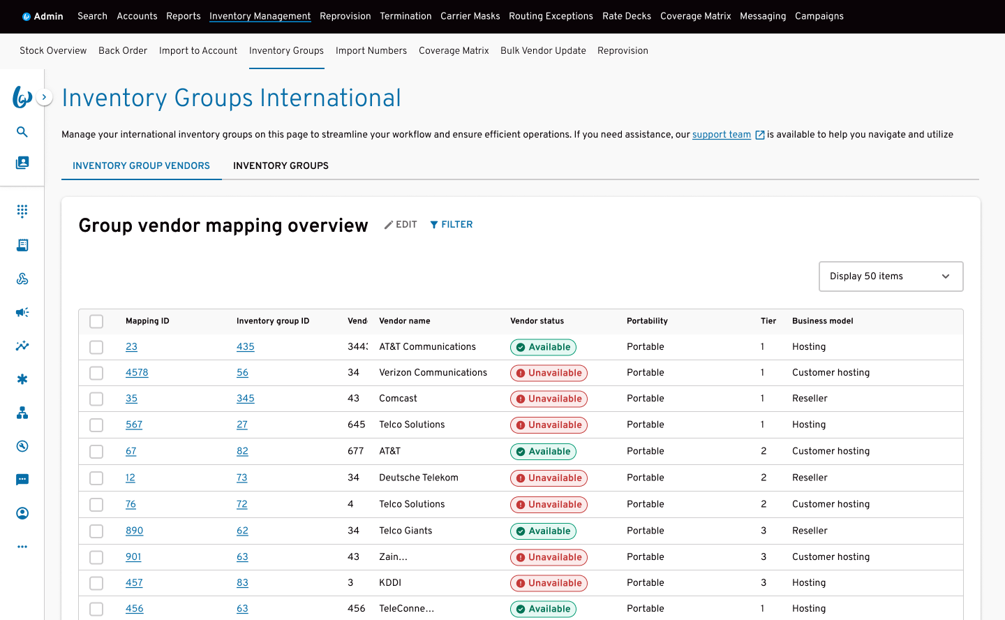
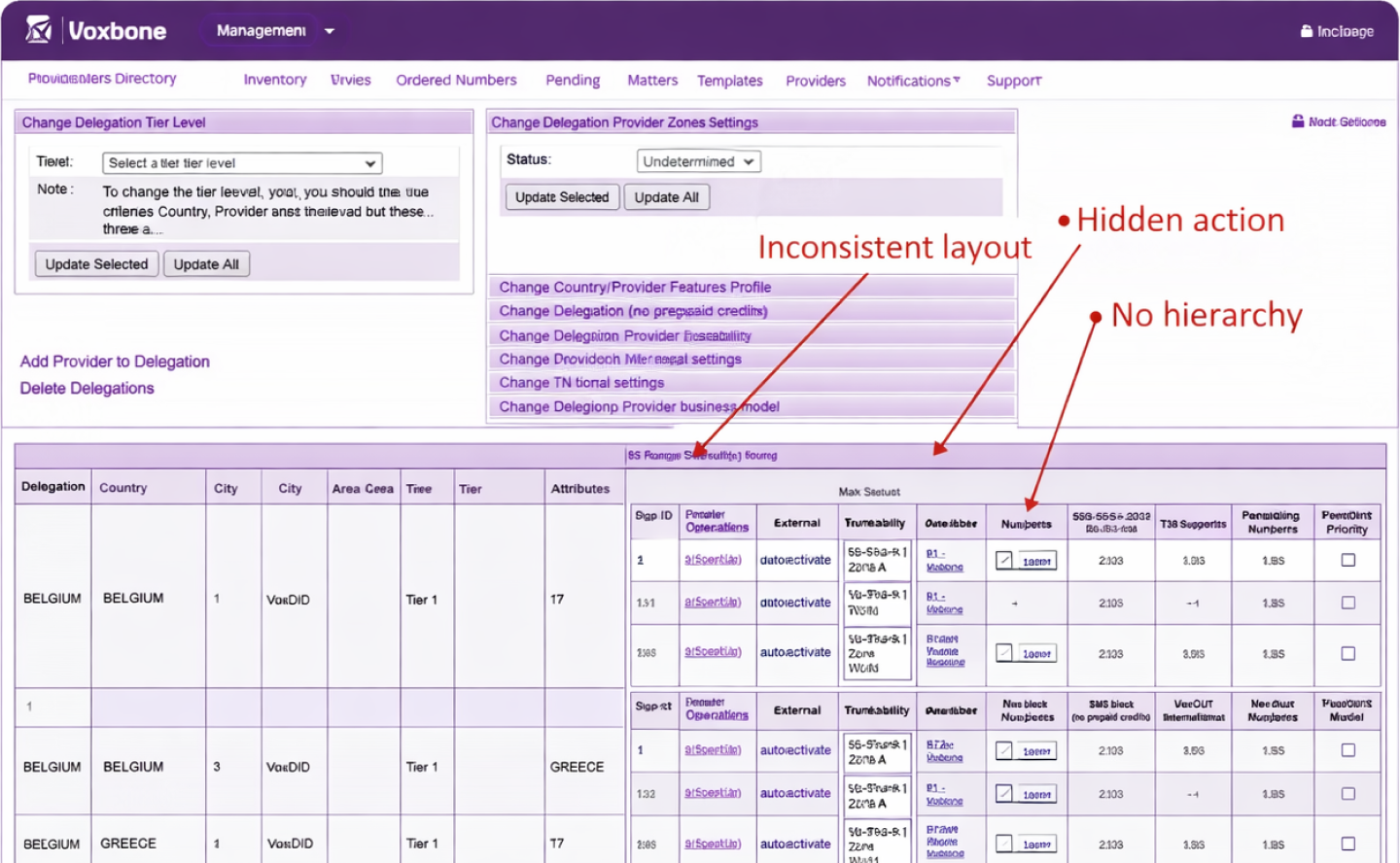
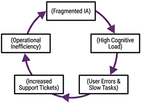
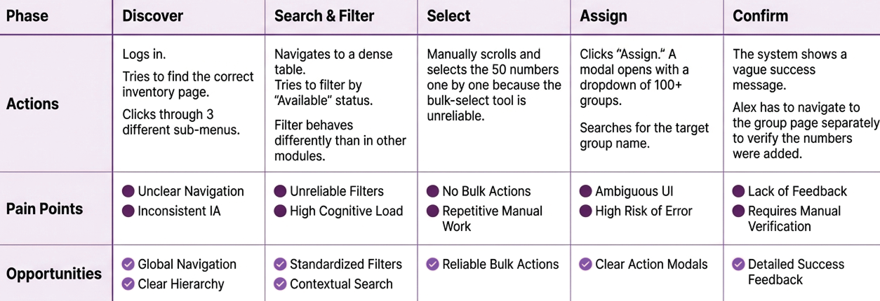
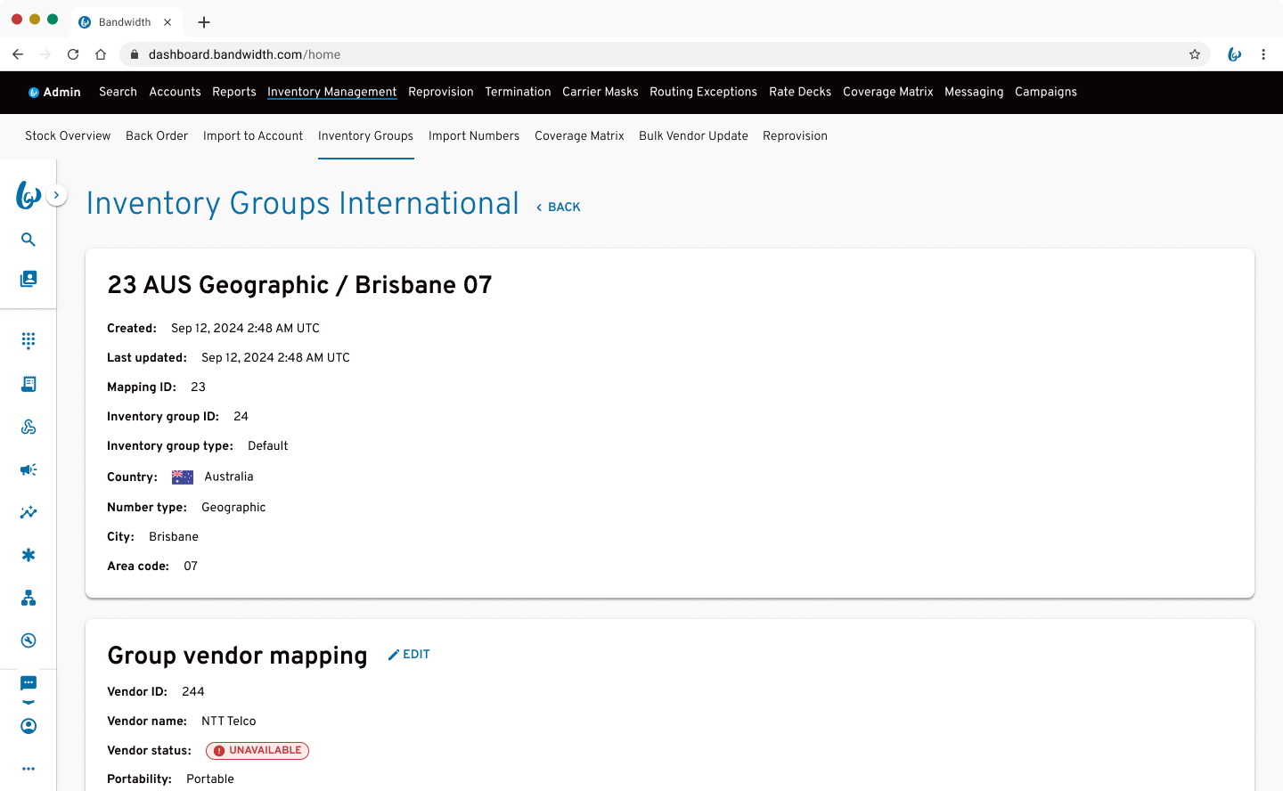
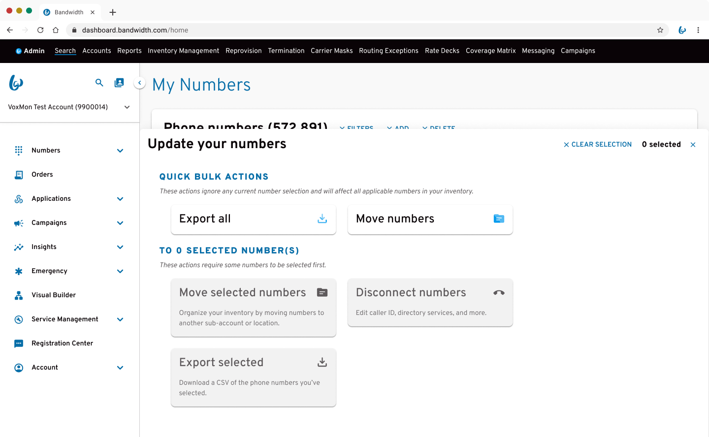
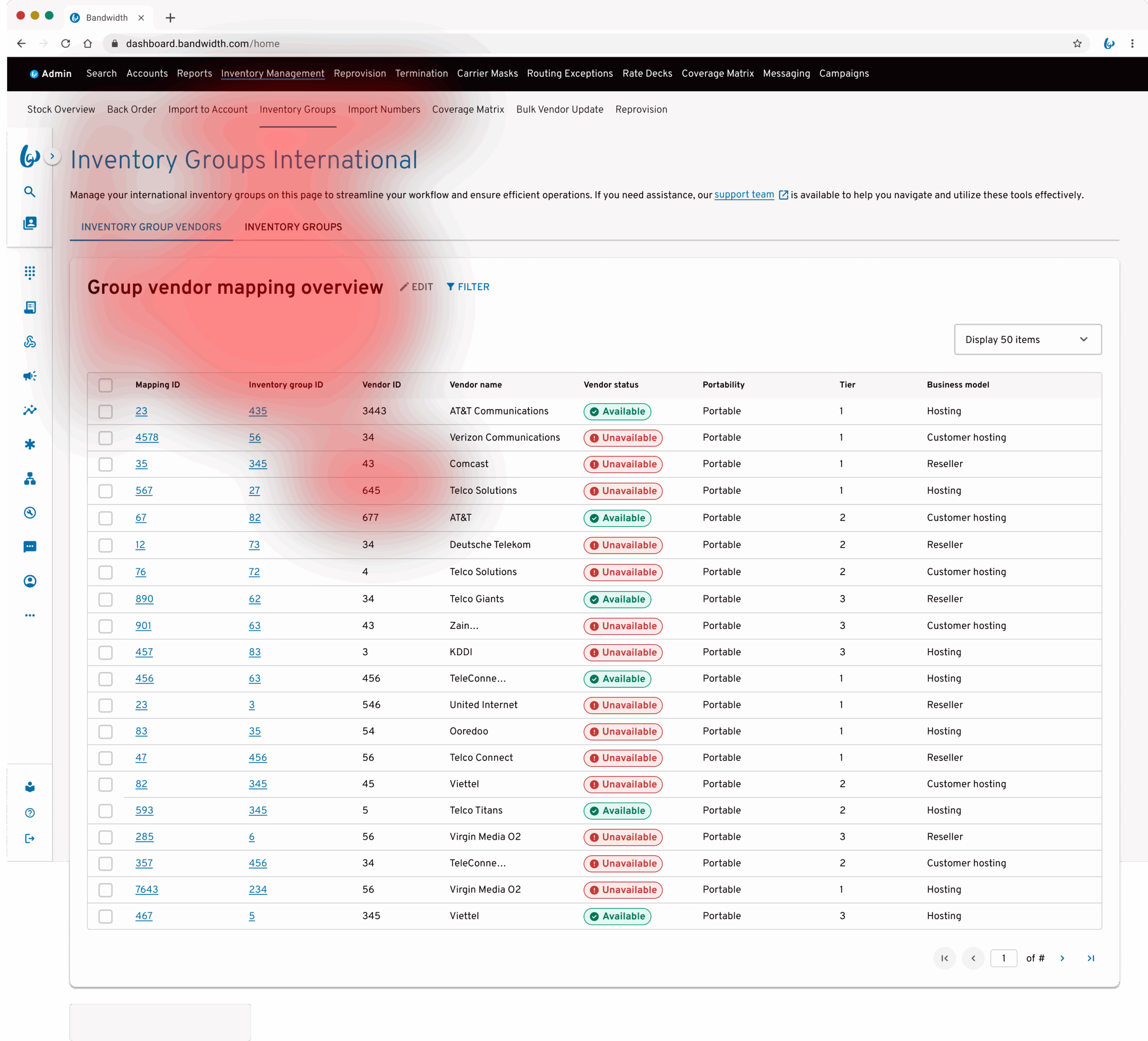
Bandwidth’s internal teams rely on Inventory Management to provision, organise, and maintain global telephone number inventory across multiple regions. Following the Voxbone integration, the experience became fragmented, combining inconsistent navigation, duplicated functionality, and unclear workflows. I redesigned the system to replace fragmented workflows with a clear, predictable structure, helping teams move faster, reduce errors, and work with confidence at scale.
