


Skip to content

IDBS (Danaher)

Building a scalable, accessible design system for scientific software

IDBS was moving from its established E-WorkBook platform towards Polar, a cloud-based environment for managing complex scientific research data. As the product ecosystem grew, teams created similar interface patterns independently. Components were duplicated, behaviours varied between modules and accessibility depended too heavily on individual feature teams.

I led the creation of the Polar Design System, establishing shared foundations, components, accessibility requirements and documentation. The work gave Design, Engineering and QA a common language for building more consistent scientific products.

This was not a Figma library project. It was a product-delivery and scalability programme.

40% faster

Design-to-development handover after shared patterns were introduced
Directional internal estimate — not a formally tracked metric

250+

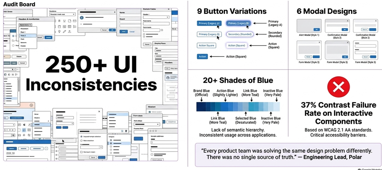
Interface inconsistencies catalogued during the initial audit
Discovery scale — not a count of resolved defects

5+ teams

Product teams supported through shared foundations and documentation
Adoption definition to be confirmed

WCAG 2.1 AA

Requirements introduced across priority components
Unresolved items retained for retesting
macbook_pro
A shared foundation for consistent scientific workflows.

Role

Senior UX Designer & Systems Architect

Duration

~3 months

TEAM

UX Lead, Product Owner, Front End Engineering, QA, Brand & Marketing

FOCUS

Design Systems, Accessibility, Token Architecture, Figma, React Alignment, Zeroheight

01. Problem

A growing product ecosystem without a shared design language

As IDBS moved from E-WorkBook towards Polar, different teams were solving similar interface problems independently.

Buttons, forms, dialogs and navigation patterns had evolved without a shared architecture or naming system. Developers often relied on locally implemented styling, creating further differences between the design source and the production experience.

For scientists, familiar actions could look or behave differently between modules. For delivery teams, each new workflow required decisions that should already have been part of the product foundation. The platform was scaling, but its interface language was not scaling with it.

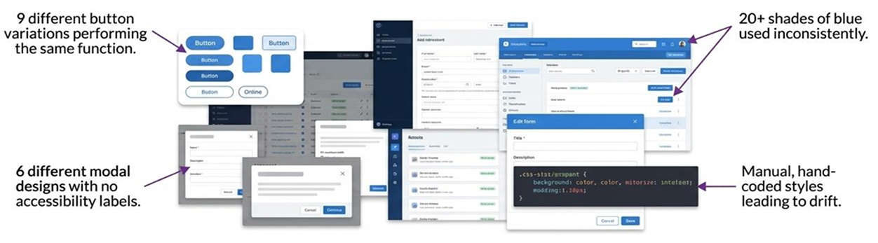
Interface fragmentation documented during the discovery audit, inconsistent buttons, modals, colour usage and hand-coded styles across products.

What scientists experienced

  • Similar actions behaved differently between modules
  • Inconsistent feedback increased cognitive effort
  • Status and validation patterns were not always predictable
  • Accessibility varied according to the team delivering the feature

What delivery teams experienced

  • Duplicated design and development effort
  • No shared component naming model
  • No semantic token structure
  • Unclear parity between Figma and React
  • Accessibility guidance applied inconsistently
  • Repeated decisions at feature level

Audit evidence

The initial review identified examples including:
  • Multiple button variations serving similar purposes
  • Different modal and dialog patterns
  • More than 20 shades of blue without a semantic hierarchy
  • Inconsistent keyboard-focus states
  • Duplicated styling with no shared token model

The problem was not a shortage of components. It was the absence of a system connecting them.

02. Challenge

Creating consistency without slowing product delivery

The task was not to redesign every screen or freeze Polar into a rigid library. Polar supported specialist scientific workflows. The system needed to improve consistency while retaining enough flexibility for complex data, different product modules and incremental engineering delivery.

Simplifying too aggressively could remove useful product behaviour. Standardising too little would allow fragmentation to continue.

How might we create a shared product language that improves consistency and accessibility while helping teams design and build faster?

Elena, Frontend Developer

“I just want to build features without having to guess which hex hex code or spacing value to use. Give me a component that / know is already approved and accessible.”

Goals

  • Ship features faster with fewer bugs.
  • Ensure the Ul is accessible without manual checks.
  • Reduce time spent debating minor style details.

Frustrations

  • Inconsistent Figma specs lead to rework.
  • No central place to find approved components.
  • Constantly re-coding the same Ul
David, Product Designer

“I need to focus on complex scientific workflows, not on reinventing a date picker. A reliable system lets me solve bigger user problems.”

Goals

  • Design consistent and intuitive user flows quickly.
  • Ensure brand and accessibility compliance.
  • Collaborate more effectively with developers

Frustrations

  • Ul designs drift visually across different modules.
  • Onboarding new designers is slow and inconsistent.
  • Too much time is spent on Ul minutiae instead of UX
The two primary internal consumers of the design system a frontend developer and a product designer whose goals and frustrations shaped the system's priorities.

03. Objective

Organisational and product goals

Business goals

Product goals

04. Discovery & Audit

Understanding where inconsistency was costing the product

Before creating new components, I audited E-WorkBook and early Polar interfaces.

I reviewed visual styles, component variations, interaction behaviour, accessibility states and implementation patterns. This helped identify where inconsistency was recurring and which problems had the widest effect across the product ecosystem.

Rather than treating every item as an isolated interface defect, I grouped the evidence into five system-level themes.

The audit board — 250+ catalogued inconsistencies across buttons, modals, colour and accessibility in the legacy interfaces.
  • UI audit
  • Accessibility review
  • Stakeholder interviews
  • Component inventory
  • Implementation review
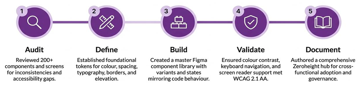
The five-stage discovery and delivery process used to move from evidence to a shipped, validated system.

Component duplication

Multiple controls served the same or similar purposes.

Consequence
Teams repeatedly designed, built and tested familiar interface behaviour.

Visual inconsistency

Colour, typography, spacing, borders and elevation lacked a shared hierarchy.

Consequence
Users received inconsistent signals about priority and interaction.

Interaction inconsistency

Similar components behaved differently between products.

Consequence
Scientists needed to relearn familiar actions between modules.

Accessibility gaps

Focus, contrast, keyboard behaviour and status communication were incomplete or inconsistent.

Consequence
Accessibility depended on local feature decisions instead of shared requirements.

Implementation drift

Figma and production code did not share a reliable naming or token structure.

Consequence
Engineers needed to reinterpret design specifications during implementation.
Each audit finding was recorded using the same structure: Legacy example → System category → User or delivery problem → Product implication.

Turning evidence into priorities

Legacy findingCategoryProblemProduct implication

20+ shades of blue

Visual inconsistency

No semantic colour hierarchy

Inconsistent action priority across modules

Multiple button variants

Component duplication

No shared naming convention

Users relearn interactions between features

No visible focus ring

Accessibility gaps

Missing keyboard indicator

Fails WCAG 2.1 AA for keyboard users

Four modal patterns

Interaction inconsistency

No shared dialog pattern

Unpredictable user experience

Figma vs code divergence

Implementation drift

No naming parity

Extra interpretation required at handoff

Synthesis of audit findings across four system-level themes — the basis for the five design system priorities.

05. Accessibility foundations

Moving accessibility into the foundations

Accessibility was not treated as a final review phase. It became one of the criteria for deciding how foundations, tokens and components should be created. I reviewed priority interaction patterns against WCAG 2.1 AA requirements and worked with Engineering and QA to identify risks that were repeating across products

Recurring risks

  • Insufficient contrast in text, controls and status treatments
  • Missing or inconsistent keyboard-focus indicators
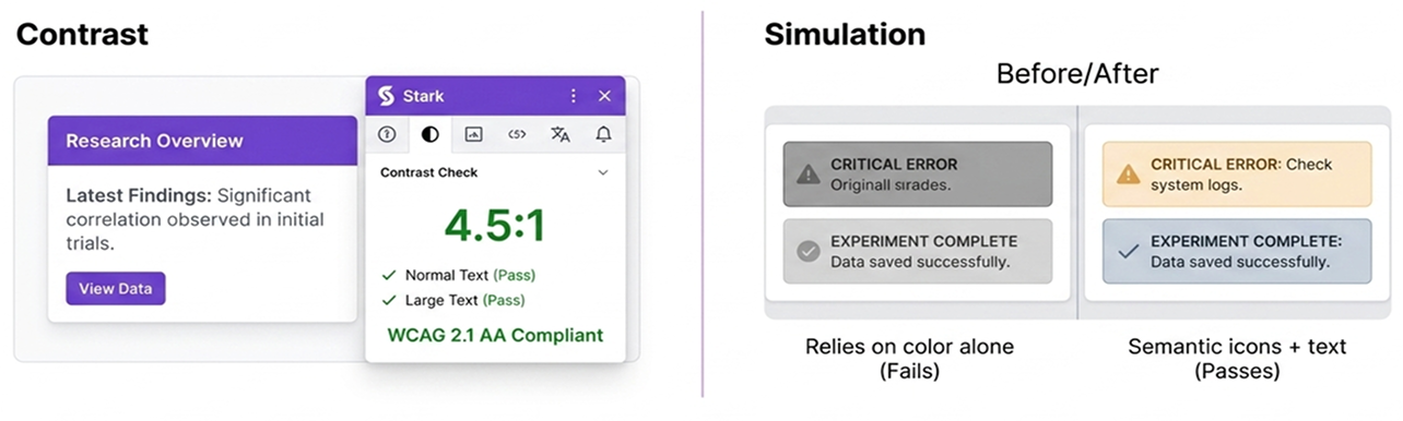
  • Status communicated through colour alone
  • Form errors without clear recovery guidance
  • Incomplete keyboard interaction expectations
  • Inconsistent semantic and screen-reader guidance

System response

  • Approved semantic contrast combinations at every text size
  • Shared keyboard-focus treatment for all interactive elements
  • Icon, text and colour used together for every status state
  • Descriptive error copy with programmatic association
  • Keyboard behaviour documented per component
  • Accessibility criteria included in component specifications
Accessibility validation in practice — contrast checking with Stark and before/after semantic status treatments using icon + text + colour.

Instead of asking whether one screen was accessible, we began asking whether the system helped teams produce accessible screens by default.

Priority component review

Priority components were reviewed across five criteria. A component was not considered complete simply because it looked correct in Figma.
Component
Visual
Keyboard
Contrast
Screen reader
Code parity
Button
Pass Pass Pass Pass Pass
Input
Pass Pass Pass Retest Pass
Modal
Pass Retest Pass Retest Pass
Table
Pass Pass Pass Pass Retest
Tabs
Pass Retest Pass Pass Pass
Retest items remained visible until resolved. Unresolved items were not hidden from the record.

06. Alignment and decision-making

Creating a shared definition of good

A design system only works when the teams building and using it understand why it exists.

I facilitated discussions across UX, Engineering, QA and Product to align the system around three shared priorities. These discussions helped reposition the work from a UX-owned component library to shared product infrastructure.

◈
Shared language

Designers and developers needed consistent names for tokens, states and components. Without this, the same decisions were made in different ways depending on who was building the feature.

⬡
Accessibility by default

Cross-functional review mapped how existing component properties were named in React and identified where semantic names would require migration effort at the component level.

↻
Contribution & governance

The system needed to evolve without returning to the fragmentation it was created to address. A clear contribution model protected consistency as the product grew.

Decision under constraint

One of the most important decisions involved token naming and how to align design vocabulary with engineering implementation.

Tension

Engineering challenged semantic token naming that did not align with their current implementation structure, creating a risk that design and code would use different vocabularies.

Evidence

Cross-functional review mapped how existing component properties were named in React and identified where semantic names would require migration effort at the component level.

Decision

Semantic names were kept for design intent; a short-form alias was agreed for engineering where migration would have slowed priority component delivery.

Trade-off accepted

Token naming is not perfectly aligned in the first release. A migration path was documented for the next adoption cycle rather than blocking delivery.

07. Design-system strategy

From visual styles to a scalable system architecture

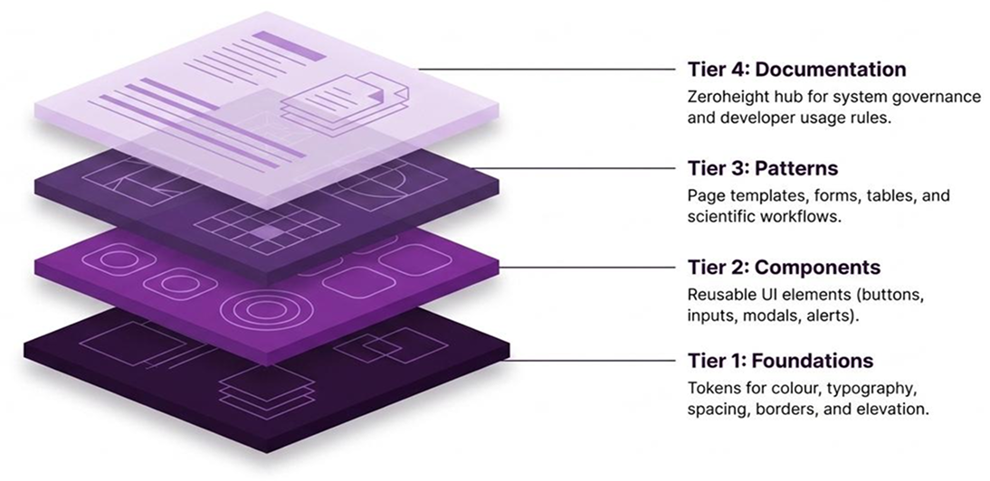
The audit showed that standardising isolated components would not solve the underlying problem. Polar needed an architecture that connected foundational decisions to components, complete workflows, implementation and long-term maintenance. I created a four-tier system model. Each layer reduced the number of decisions teams needed to remake at feature level.
The four-tier architecture — each layer building on the one below, reducing the decisions teams need to remake at feature level.

08. Token Architecture

Creating one language across design and development

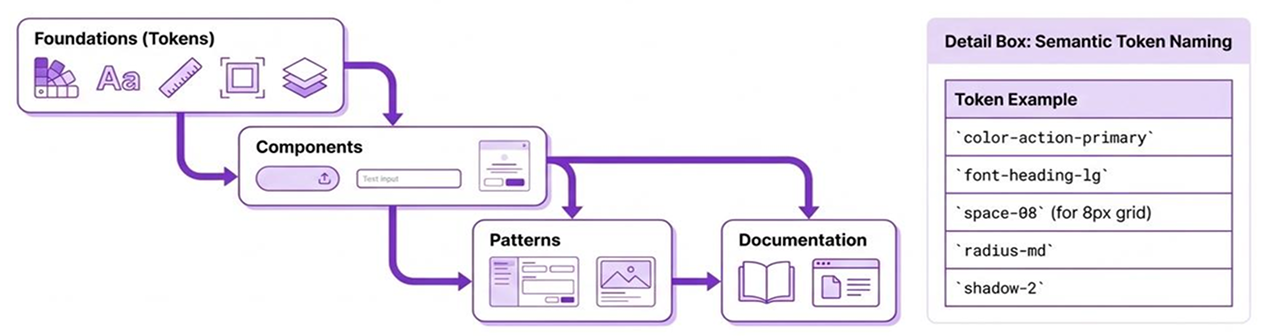
Previously, styles were often tied directly to visual values. I introduced a semantic token model that separated raw values from their intended purpose, allowing design and code to refer to the same decisions in a consistent way.

From value to product

#0066CC
blue-600
colour-action-primary
Button / primary
Product interface
A blue value became a named action token, applied to the primary Button component and inherited by product workflows.
The semantic token naming model — purpose-describing names like colour-action-primary shared across Figma and React.

Colour

Semantic roles for action, feedback, text, border and surface. Accessible contrast at every tier.

Typography

Shared hierarchy across display, body, label and caption scales. Consistent between Figma and code.

Spacing

A named scale giving predictable layout rhythm without repeated spacing decisions.

Radius and elevation

Shared corner geometry and shadow values maintaining layer hierarchy consistently.

Accessibility

Status and focus treatments baked into foundations rather than applied per-component.

09. Components and product patterns

Designing behaviour, not just appearance

Each component was treated as an interaction model. Structure, hierarchy, responsive behaviour, accessibility and implementation expectations were defined alongside its visual states. The system created value when these elements worked together inside complete product tasks.

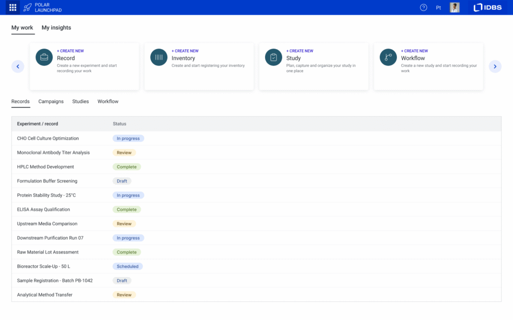
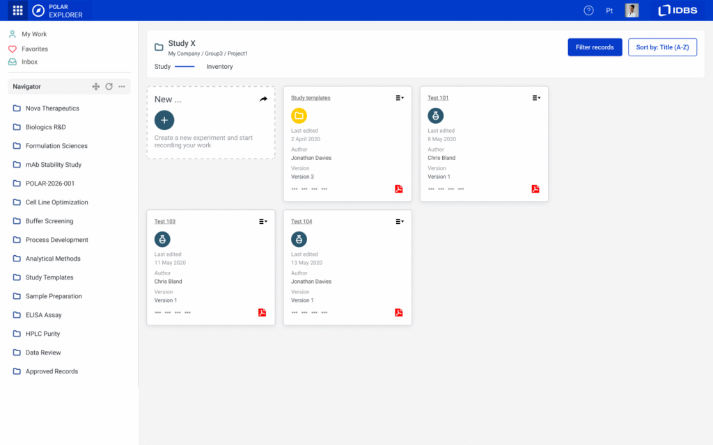
The component families were validated inside real Polar products — Launchpad, Explorer (ELN) and Inventory — each with distinct workflow needs served by the same shared foundations.

Polar Launchpad

Records, campaigns and studies — navigation and data table patterns at scale.

Polar Explorer — ELN

Scientific study management using card, navigation and action components.

Polar Inventory

Material search and filter workflows using input, filter and layout patterns.

Primary and secondary buttons, button groups and switches

When to use

Use for all user-initiated state changes and navigation triggers.

Fields, dropdowns, search, selection controls and validation

When to use

Use wherever users enter, select or modify structured data.

Banners, notifications, badges, chips and progress indicators

When to use

Use to communicate system status, action outcomes and async progress.

Global navigation, breadcrumbs, page headers, tabs and tree menus

When to use

Use to orient users and enable movement between sections and contexts.

Tables, cards, lists, pagination and toolbars

When to use

Use for presenting structured datasets and supporting record-level actions.

Modals, dialogs, popovers and confirmations

When to use

Use for focused tasks and decisions that interrupt the primary workflow.

10. Figma → React Alignment

Reducing the gap between design intent and implementation

I worked with front-end engineers to align token names, component structure, properties and interaction states. The goal was for Figma and React to express the same underlying system rather than requiring engineering to reinterpret static designs.

This gave designers clearer constraints, developers more reusable specifications and QA a consistent set of behaviours to validate.

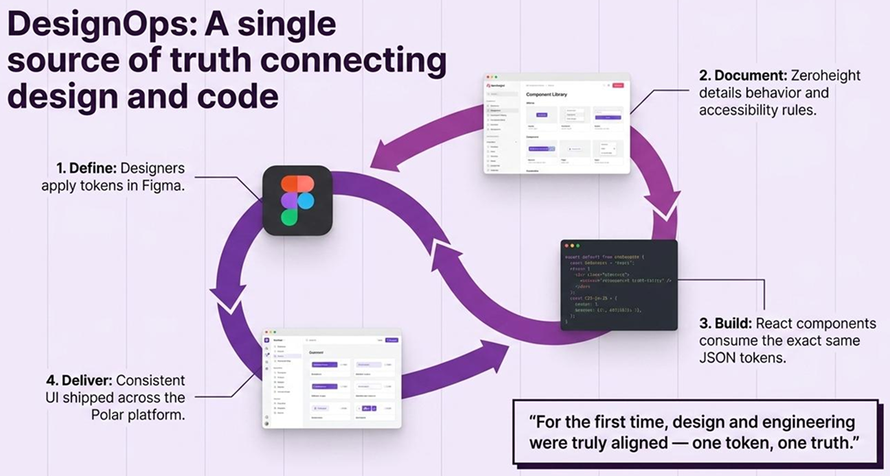
DesignOps in practice — one token, one truth. Figma variables → Zeroheight documentation → React JSON tokens → consistent Polar product delivery.

Shared delivery model

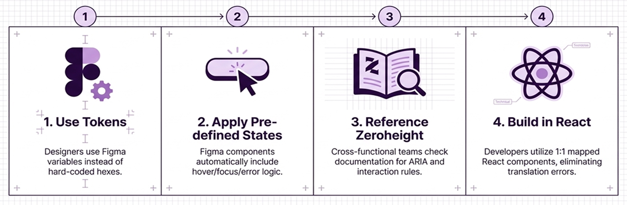
The four-step workflow: designers use Figma token variables → pre-defined states auto-included → Zeroheight ARIA reference → 1:1 React components with no translation errors.

Designers

Clearer constraints and reusable product patterns reduced time spent on implementation decisions.

Engineers

More consistent naming and implementation-ready specifications reduced interpretation between Figma and React.

QA

A shared set of behaviours and states provided clearer acceptance criteria across component reviews.

Figma — Button component

  • Variant Primary · Secondary · Ghost · Destructive
  • Size Large · Medium · Small
  • State Default · Hover · Focus · Active · Disabled · Loading
  • Icon Leading · Trailing · Icon only

Implementation specification

  • variant "primary" | "secondary" | "ghost" | "destructive"
  • sixe "lg" | "md" | "sm"
  • isDisabled boolean
  • leadingIcon ReactNode
  • onClick () => void

11. Documentation and governance

Making the system usable beyond Figma

A component library could not create consistency on its own. Teams needed to understand when to use a component, how it behaved, its accessibility requirements and how proposed changes would be reviewed. I structured the Zeroheight documentation around five areas. Components answered what to use. Documentation explained why, when and how.
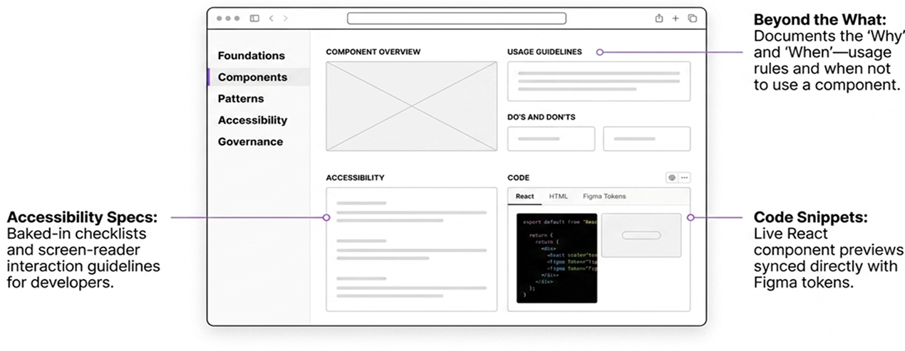
The Zeroheight hub — going beyond 'what' to document 'why', 'when', accessibility specs and live React code snippets synced to Figma tokens.

Foundations

Colour, typography, spacing, grid and iconography.

Components

Usage, variants, states and behaviour.

Patterns

Forms, tables, navigation, notifications and validation.

Accessibility

Keyboard expectations, contrast, assistive-technology guidance and review checklists.

Governance

Ownership, contribution, review, release, versioning and deprecation.

Contribution model

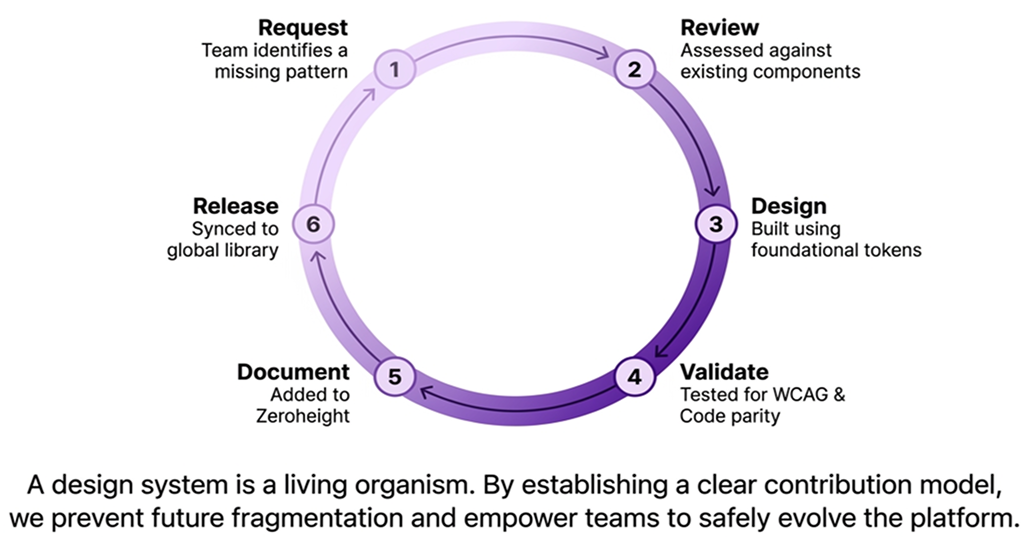
The contribution governance loop — a living process that prevents future fragmentation and empowers teams to safely evolve the platform.

Why governance followed the foundations

Governance was introduced after the first system foundations because delivery pressure and unresolved ownership across product teams made it difficult to agree contribution criteria before there was something concrete to contribute to. This sequencing allowed the core component library to move forward without stalling on process decisions.

The retrospective learning was not simply to start governance earlier. It was to agree lightweight ownership, decision rights and contribution criteria at the same time as the first foundations — then expand the process as adoption grew and real contribution needs emerged.

12. Validation and outcomes

Testing the system through product delivery

Validation took place throughout the project. Priority components were reviewed with Engineering and QA across visual consistency, keyboard behaviour, contrast, screen-reader support and code parity before patterns were repeated across product experiences.

What we evaluated

  • Design-to-development handover
  • Accessibility defects and retest items
  • Product-team feedback
  • Component and token adoption
  • Consistency between Figma and implemented components
  • Application of shared patterns in real workflows
ClaimDefinitionMethodPeriodConfidence

40% faster handover

Time from approved design to implementation-ready handover

Comparing comparable workflows before and after shared patterns were introduced

Internal delivery comparison, 2024

Directional estimate

250+ audit findings

Inconsistencies catalogued across E-WorkBook and early Polar interfaces

Structured UI audit — visual, interaction, accessibility and implementation review

Audit conducted Q3 2024

Discovery scale

5+ teams on shared foundations

Product teams with active use of shared component library or token set

Adoption tracking — component library access and integration confirmed

At first system release, 2024

Measured

WCAG 2.1 AA requirements

Accessibility requirements incorporated into priority component specifications

Component-level audit using Stark, Axe DevTools and WAVE. Retest items documented

Throughout delivery, 2024

Measured

How to read the handover estimate

The 40% figure is a directional internal estimate based on comparing the time from approved design to implementation-ready handover across comparable workflows before and after the shared patterns were introduced. It is not a formally measured outcome and should be read alongside the audit evidence rather than as a standalone result.

The most important shift was behavioural. Teams increasingly started with shared foundations rather than recreating familiar interface decisions for each feature.

13. Impact

More than a component library

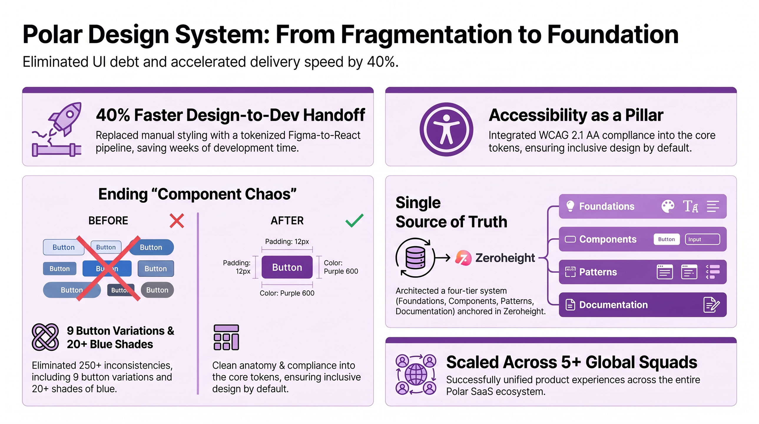
The Polar Design System established a shared foundation for product delivery. It reduced repeated decisions, improved the consistency of scientific workflows and gave teams a clearer way to discuss quality across Design, Engineering and QA.
From fragmentation to foundation — the four pillars of impact across the Polar SaaS ecosystem.

For scientists

More predictable interactions and feedback across Polar modules reduced the need to relearn familiar controls between workflows. Product-user impact is inferred from improved consistency and requires further validation with scientific users.

Qualitative — inferred from consistency improvements

For product teams

Reusable foundations and components reduced repeated design decisions and gave teams a shared starting point for new workflows.

Evidenced — adoption tracked across 5+ teams

For engineering and QA

Shared tokens, states and specifications reduced interpretation between Figma and React. QA gained clearer acceptance criteria — an enabler of product quality rather than a business-level outcome in itself.

Evidenced — spec alignment and handover comparison

For IDBS

A reusable product infrastructure reduced the risk of every new Polar module recreating the same design and accessibility debt. The business value is more consistent product delivery and a stronger foundation for scaling the platform.

Expected — platform scalability projected

The Polar Design System connected design decisions, engineering delivery and product quality into one shared language — making it possible to scale Polar without scaling the inconsistency alongside it.

14. Retrospective

How I would strengthen the system from the start

  • Define governance alongside the foundations I would establish lightweight ownership, decision rights and contribution rules alongside the first foundations. This would make responsibilities clearer and give teams an agreed way to evolve the system from the beginning.
  • Set an adoption baseline before release I would measure component adoption, detached Figma instances, code reuse, accessibility defects and documentation usage before releasing the system. This would make its effect easier to evaluate over time.
  • Involve more product teams earlier I would include a wider range of product teams during early validation. Their specialist scientific workflows could have revealed additional edge cases before components reached broader use.
  • Capture product impact throughout delivery I would record comparable before-and-after product screens and workflow evidence as the system was introduced. This would create a clearer connection between system decisions and improvements in the product.
  • Record trade-offs more deliberately I would document the alternatives considered, constraints encountered and compromises accepted during major system decisions. This would preserve valuable context for teams maintaining the system later.

15. Future opportunities

Evolving the system as product infrastructure

The first release established the foundations needed to scale Polar more consistently. The next stage would extend those foundations into specialist scientific patterns and introduce clearer ways to measure the health of the system over time.
These are future opportunities, not claims about work completed in the initial release.

Scientific data visualisation

 
Evidence today
Scientific users regularly work with dense charts, graphs and tabular data.
 
Opportunity
Extend the system into charts, graphs and complex scientific data presentation.
 
Validation needed
Pattern review with scientific users and engineering feasibility assessment.


Future opportunity — not delivered in this phase.

System analytics

 
Evidence today
Current adoption is tracked informally without tooling.
 
Opportunity
Measure component adoption, code reuse, accessibility defects and documentation engagement.
 
Validation needed
Tooling audit and metric baseline established before reporting.


Future opportunity — not delivered in this phase.

Automated accessibility checks

 
Evidence today
Manual accessibility review is the current primary method.
 
Opportunity
Introduce stronger automated validation across design and development workflows.
 
Validation needed
Tool evaluation against WCAG 2.1 AA criteria and false-positive rate.


Future opportunity — not delivered in this phase

Expanded workflow patterns

 
Evidence today
Forms, data review and comparison tasks recur across scientific workflows.
 
Opportunity
Develop reusable structures for complex forms, data review and scientific decision-making.
 
Validation needed
Pattern identification across Polar modules, user testing of key journeys.


Future opportunity — not delivered in this phase.

Multi-brand exploration

 
Evidence today
Danaher operates multiple products using similar domain patterns.
 
Opportunity
Assess whether the semantic token architecture could support other products without weakening Polar’s identity.
 
Validation needed
Token audit across product brands and stakeholder alignment with wider Danaher design community.


Future opportunity — not delivered in this phase.

Reflection

The hardest part was deciding what should become standard

The unexpected challenge was not creating components. It was deciding which differences represented genuine scientific workflow needs and which were simply the result of teams solving the same problem separately. Standardising too quickly could have removed useful flexibility. Waiting for complete certainty would have allowed duplication to continue. The system needed enough structure to improve consistency while leaving space for evidence from specialist Polar workflows to change its rules.

That tension changed how I think about governance. Contribution is not only a maintenance process. It is how a design system learns where its foundations are strong, where they are too rigid and where the product requires a new pattern. Accessibility also proved most effective when it shaped the foundations. Shared contrast, focus, validation and semantic requirements improved every component and workflow that inherited them.

For Polar, consistency was not the absence of difference. It was making every difference intentional.

Selected projects​

Building a scalable, accessible design system for scientific software

IDBS was moving from E-WorkBook to Polar, a cloud platform used by scientists to manage complex research data. As the product grew, teams created similar interface patterns independently, resulting in duplicated components, inconsistent behaviour and accessibility gaps across modules. I led the creation of the Polar Design System, defining the foundations, component architecture, accessibility standards and documentation needed to align...
Redesigning complex operational workflows to simplify global telephone number management

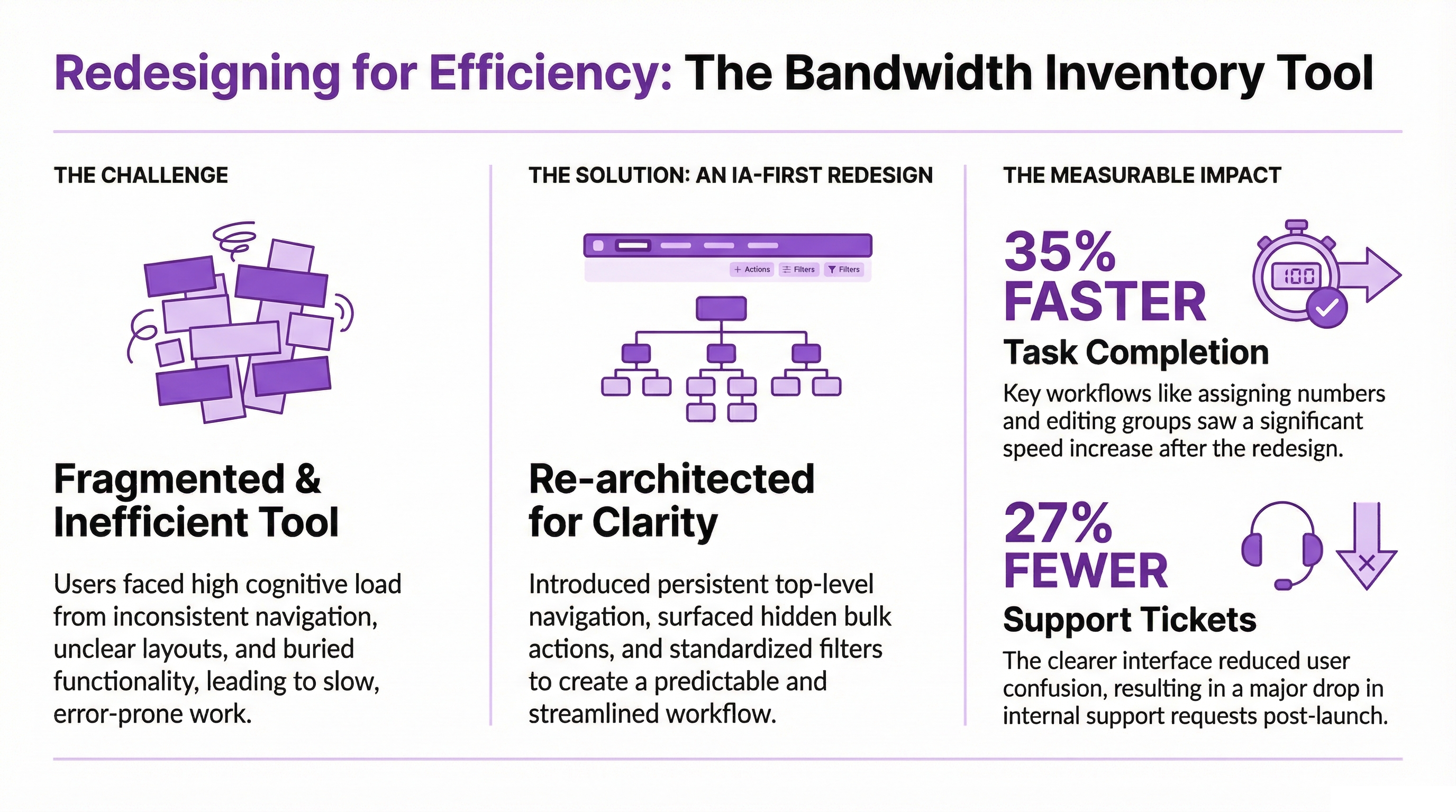
Bandwidth's internal Operations teams manage thousands of telephone numbers across multiple international markets every day. As the platform evolved through acquisitions and regional expansion, the experience became increasingly fragmented. Navigation varied between countries, key actions were difficult to find, and users often relied on experience rather than the interface to complete everyday tasks. I led the end to end redesign...